amazing!Iv121 wrote:While humor is usually good official stuff should remain serious or people wont take you seriously.
I did this so far. Wht do you think ?
Spoiler:
Community symbol
-
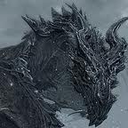
Alduin
- Cadet

- Posts:25
- Joined:Thu Dec 06, 2012 3:37 pm
- Affiliation:Dovan Empire
- Location:Dov-Class Super Star Destroyer Glories Wake

Nickname:Emperor_Revan(and roleplay)
Spoiler:


-
Prototype
- Developer
- Posts:2968
- Joined:Fri Dec 07, 2012 1:25 am
- Affiliation:NSCD
- IGN:Currently:Small_Bear
- Location:Yes
Re: Community symbol
Kickass, but I suggest maybe adding Half a galaxy as a background on the left hand side go show going from earth to spaceIv121 wrote:While humor is usually good official stuff should remain serious or people wont take you seriously.
I did this so far. Wht do you think ?
Spoiler:
Or something
Spoiler:

Mistake Not... wrote: This isn't rocket science, *!

Spoiler:


Re: Community symbol
That will be too much in my opinion, too many details...
They're watching ... 
"I am forbidden tag" -CvN
"I am forbidden tag" -CvN
-
Shadowcatbot
- Vice Admiral

- Posts:2623
- Joined:Thu Dec 06, 2012 9:46 pm
- Affiliation:Nivanshae
- IGN:_Shadowcat_
- Location:Munching on important looking wires.
Re: Community symbol
Something like this but replace the ship with a comunity made MC ship.

Wait that would be a poster for FC, Lets just shrink that one farther up.
Wait that would be a poster for FC, Lets just shrink that one farther up.
In yo ceiling, stealin yo wires
Do not open. Ever. At all. Enter at your own risk to life and limb.
Trigger warning
Bot gore warning
Memetic biohazard
Error bait
Do not open. Ever. At all. Enter at your own risk to life and limb.
Trigger warning
Bot gore warning
Memetic biohazard
Error bait
Spoiler:

Re: Community symbol
But that picture doesn't have anything to do with Minecraft, or even the future, really. It's got a picture of the Earth, but that's not the future. We've got Earth now. The star's not terrible, except that I thought your intention was for it to be a star in the sense of big plasma ball in space, which it isn't. I dunno. The impression I get from it is that it's supposed to be symbolic and stuff, but there's nothing for it to be symbolic of, so it just seems... flat, maybe? I don't know what the proper word is for that.
;.'.;'::.;:".":;",,;':",;
(Kzinti script, as best as can be displayed in Human characters, translated roughly as "For the Patriarchy!")
(Kzinti script, as best as can be displayed in Human characters, translated roughly as "For the Patriarchy!")
-
blockman42
- Lieutenant

- Posts:478
- Joined:Thu Dec 06, 2012 8:04 pm
- Affiliation:Voxel Co.
- IGN:Blockman42
- Location:Holocene
Re: Community symbol
we need explosions for sure
-
Shadowcatbot
- Vice Admiral
- Posts:2623
- Joined:Thu Dec 06, 2012 9:46 pm
- Affiliation:Nivanshae
- IGN:_Shadowcat_
- Location:Munching on important looking wires.
Re: Community symbol
A Steve holding a laser rifle blowing up a Termicreeper?
In yo ceiling, stealin yo wires
Do not open. Ever. At all. Enter at your own risk to life and limb.
Trigger warning
Bot gore warning
Memetic biohazard
Error bait
Do not open. Ever. At all. Enter at your own risk to life and limb.
Trigger warning
Bot gore warning
Memetic biohazard
Error bait
Spoiler:
-
Dux_Tell31

- Midshipman

- Posts:100
- Joined:Thu Dec 06, 2012 12:22 pm
- Affiliation:Tellrim
- IGN:tell31
Re: Community symbol
I believe this to be relevant.
Spoiler:
"This is Minecraft, sir. We don't make physics, we ruin them." -Fr0stbyte124
"We are made of the elements out in space, in essense we are the universe discovering itself" -Neil Degrasse Tyson
"We are made of the elements out in space, in essense we are the universe discovering itself" -Neil Degrasse Tyson

Re: Community symbol
IN A MECH SUIT ON A SHIP IN THE MIDDLE OF A GIANT BATTLE GOING INTO A STAR.Shadowcat wrote:A Steve holding a laser rifle blowing up a Termicreeper?
I like implementation of our forum avatar-RPs. Maybe a banner that depicts all of the vets' avatars in a pitched battle and a dragon dueling with Shiva above, all under the watchful eye of an eye-eye (aye-aye? eyeeye?) that melds with a sunset in the background.
If we had the Banhammer we could use that as an icon *cough* but we don't.
"Any sufficiently advanced technology is indistinguishable from a completely ad-hoc plot device"
— David Langford
— David Langford
Spoiler:
Re: Community symbol
Not really. That's how you make marker dots look good on a map of an area, and most of the advice is very specific to that context. It's not really applicable to what we're trying to do, which is make a logo for the forum.Dux_Tell31 wrote:I believe this to be relevant.
;.'.;'::.;:".":;",,;':",;
(Kzinti script, as best as can be displayed in Human characters, translated roughly as "For the Patriarchy!")
(Kzinti script, as best as can be displayed in Human characters, translated roughly as "For the Patriarchy!")
-
Shadowcatbot
- Vice Admiral
- Posts:2623
- Joined:Thu Dec 06, 2012 9:46 pm
- Affiliation:Nivanshae
- IGN:_Shadowcat_
- Location:Munching on important looking wires.
Re: Community symbol
Wait wait wait I think we have difrent thoughts upon this.
Is this a Small Icon, A forum Banner, or an FC promo poster?
Is this a Small Icon, A forum Banner, or an FC promo poster?
In yo ceiling, stealin yo wires
Do not open. Ever. At all. Enter at your own risk to life and limb.
Trigger warning
Bot gore warning
Memetic biohazard
Error bait
Do not open. Ever. At all. Enter at your own risk to life and limb.
Trigger warning
Bot gore warning
Memetic biohazard
Error bait
Spoiler:
Re: Community symbol
This is a BIG Icon to start with :P (800x800) , it is a symbol that can be used in banners, promos, pretty much anywhere you need us to be recognised.
@ LJS I cannot make a big block in the middle of the symbol because it looks disconnected and ugly even though it is most directly connected to futurecraft. If we make a space mode the star will do just fine. We need a background for it so I picked earth to "Unite us" because no other suggestions were given. If we plan to become a social gaming community we should find something that unites all games or things we do thus no game specific content. If you have any additional suggestions and specific ways to improve it just say.
@ LJS I cannot make a big block in the middle of the symbol because it looks disconnected and ugly even though it is most directly connected to futurecraft. If we make a space mode the star will do just fine. We need a background for it so I picked earth to "Unite us" because no other suggestions were given. If we plan to become a social gaming community we should find something that unites all games or things we do thus no game specific content. If you have any additional suggestions and specific ways to improve it just say.
They're watching ...
"I am forbidden tag" -CvN
"I am forbidden tag" -CvN
-
Error
- Moderator
- Posts:4205
- Joined:Thu Dec 06, 2012 11:49 am
- Affiliation:CNI
- IGN:FC_Rangefinder
- Location:Sol IIIa, School of Hard Knocks
Re: Community symbol
Maybe make some insignia for the center of the image, then (13) miniature stars around it.
One for each (current) RP faction on FCF?
Numbers will go up, probably, but this is a start, I guess?
idk.
One for each (current) RP faction on FCF?
Numbers will go up, probably, but this is a start, I guess?
idk.

Re: Community symbol
It will be worse than the American flag :P . What you actually say there is to make a star for each member of the community, excluding some weirdoes such myself who do not take part in the roleplay section.
They're watching ...
"I am forbidden tag" -CvN
"I am forbidden tag" -CvN
-
Error
- Moderator
- Posts:4205
- Joined:Thu Dec 06, 2012 11:49 am
- Affiliation:CNI
- IGN:FC_Rangefinder
- Location:Sol IIIa, School of Hard Knocks
Re: Community symbol
Your is the better idea, da.
And I mean the stars would encircle the insignia, not sit in a corner.
And I mean the stars would encircle the insignia, not sit in a corner.